HINGE
End-to-end design of Hinge — the dating app designed to be deleted. Including concept, validation, testing, prototyping, UI, UX, high fidelity designs and animations. Creative direction and production of the login video and App Store photography.
GAP
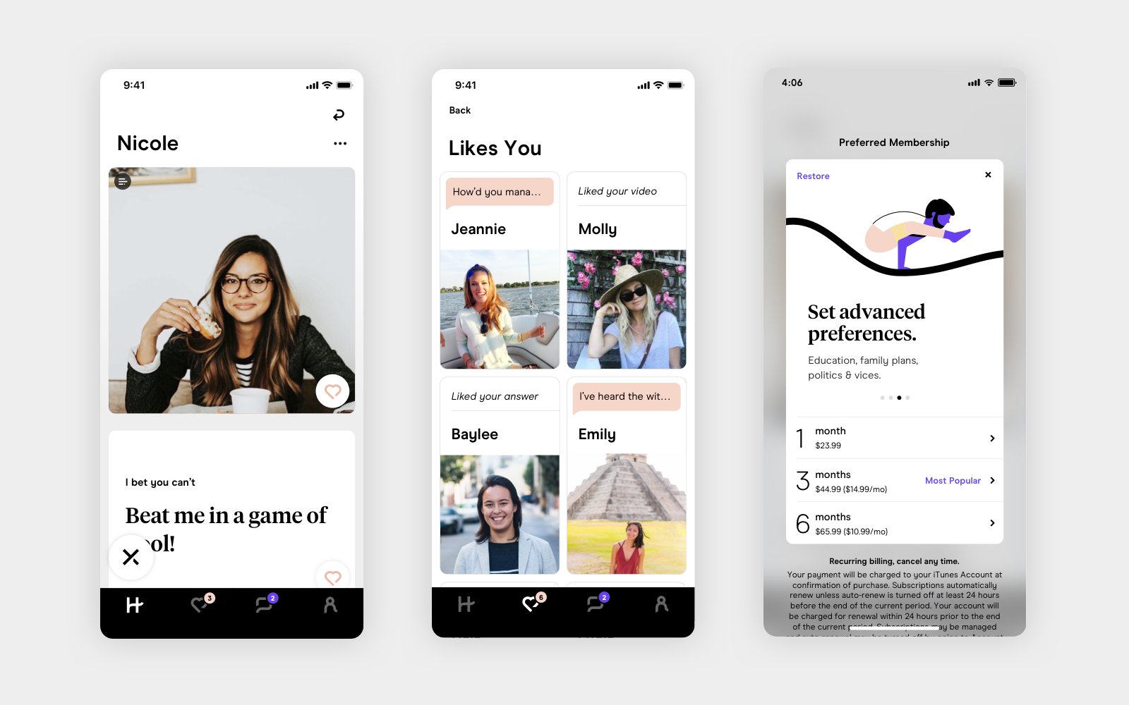
Hinge is designed to give you a sense of someone’s personality. Users get to know potential dates through their unique answers to prompts, and personal information like religion, height, and politics.
GAP
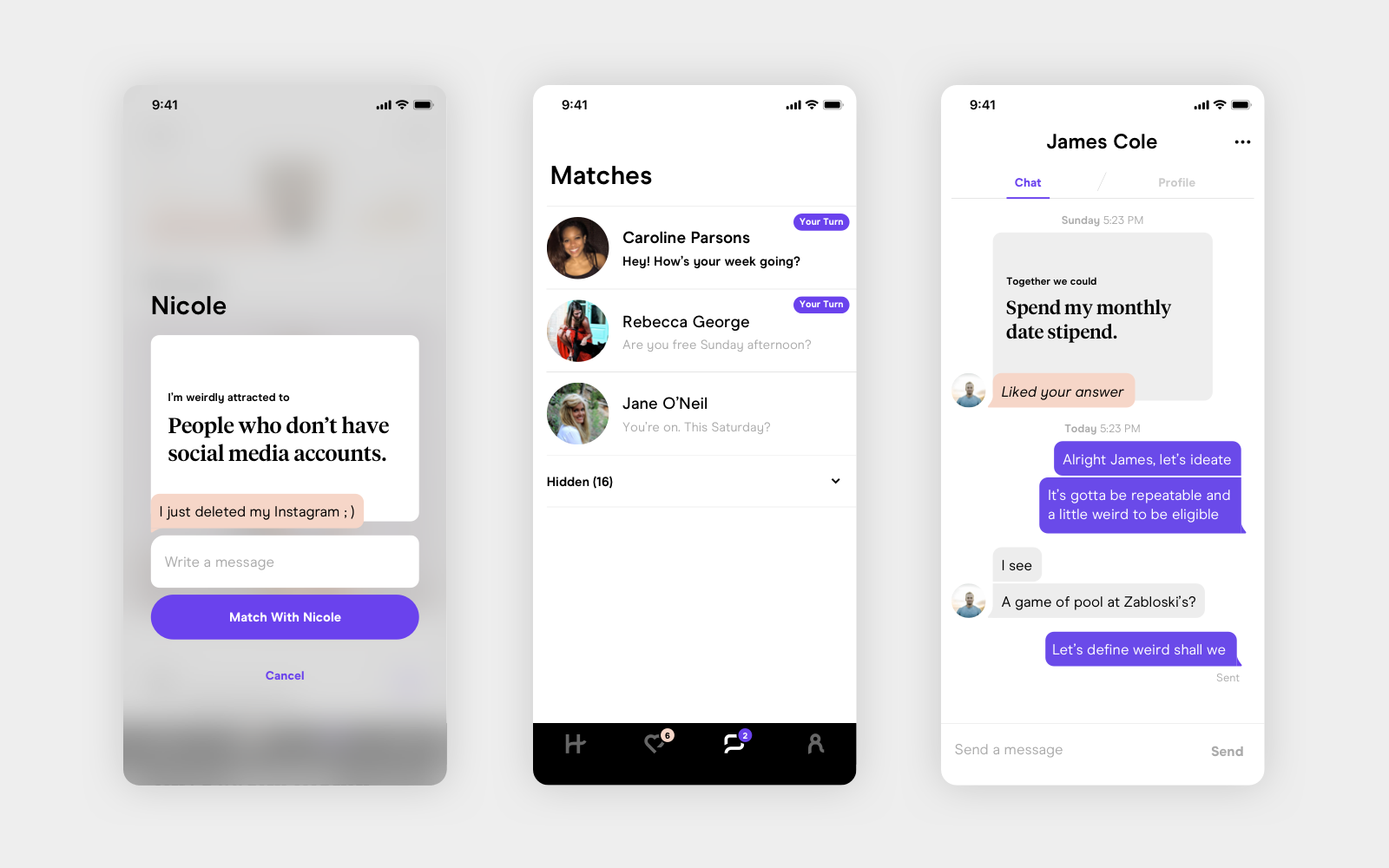
Instead of the traditional swiping interface, every match begins by someone liking or commenting on a specific part of a profile. We wanted to make it easier to start conversations that were more interesting than ‘Hey how’s your week going?’
BLANK
Creating an animation system for all interactions was really important for maintaining a consistent tone.
GAP
Custom loading animations for the Discover, Likes You, and Match screens. These were a lot of fun to make.
GAP
Branded illustrations and animations throughout onboarding were designed to bring a sense of lightheartedness and optimism to a process that can be daunting. I loved playing on the tagline 'Designed to be Deleted'. Representation of different ethnicities, body types, abilities, and backgrounds was really important.
GAP
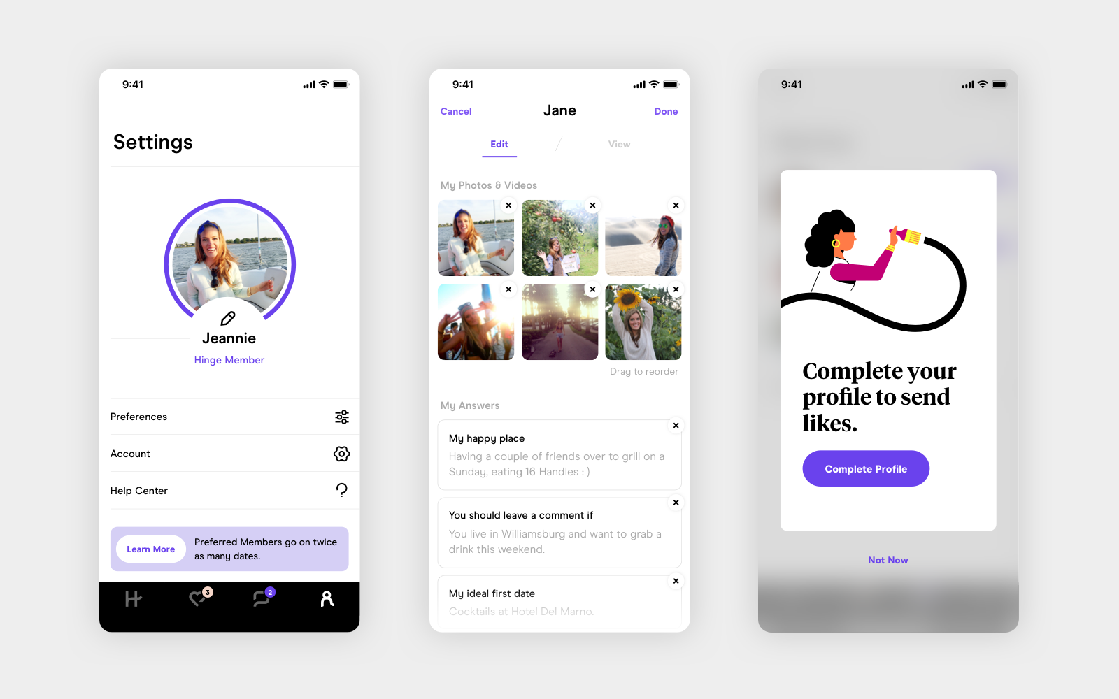
Profiles are designed to let you show more of your personality. Completing all sections of your profile is mandatory for all users.
GAP
‘We Met’ was designed to check in on how users dates are going. After exchanging phone numbers with a Match, Hinge follows up to hear how the date went so they can make better recommendations in the future.
Blank
More animation details. The onboarding progress bar, the prompts carousel, profile competion progress.
Select Work
urlTogetherProduct Design & Branding

Hinge PhotographyCreative Direction & Production
MezzanineProduct Design

HingeProduct Design & Art Direction
HomelandProduct Design
AndexProduct Design & Branding
FiClubProduct Design
MatchmakerProduct Design
Flesh CardsGame Design & Branding
Kate McLeodBranding