MEZZANINE
Concept validation, user research, UX, UI for Mezzanine — a vertical social network for curiouss young people.
BLANK
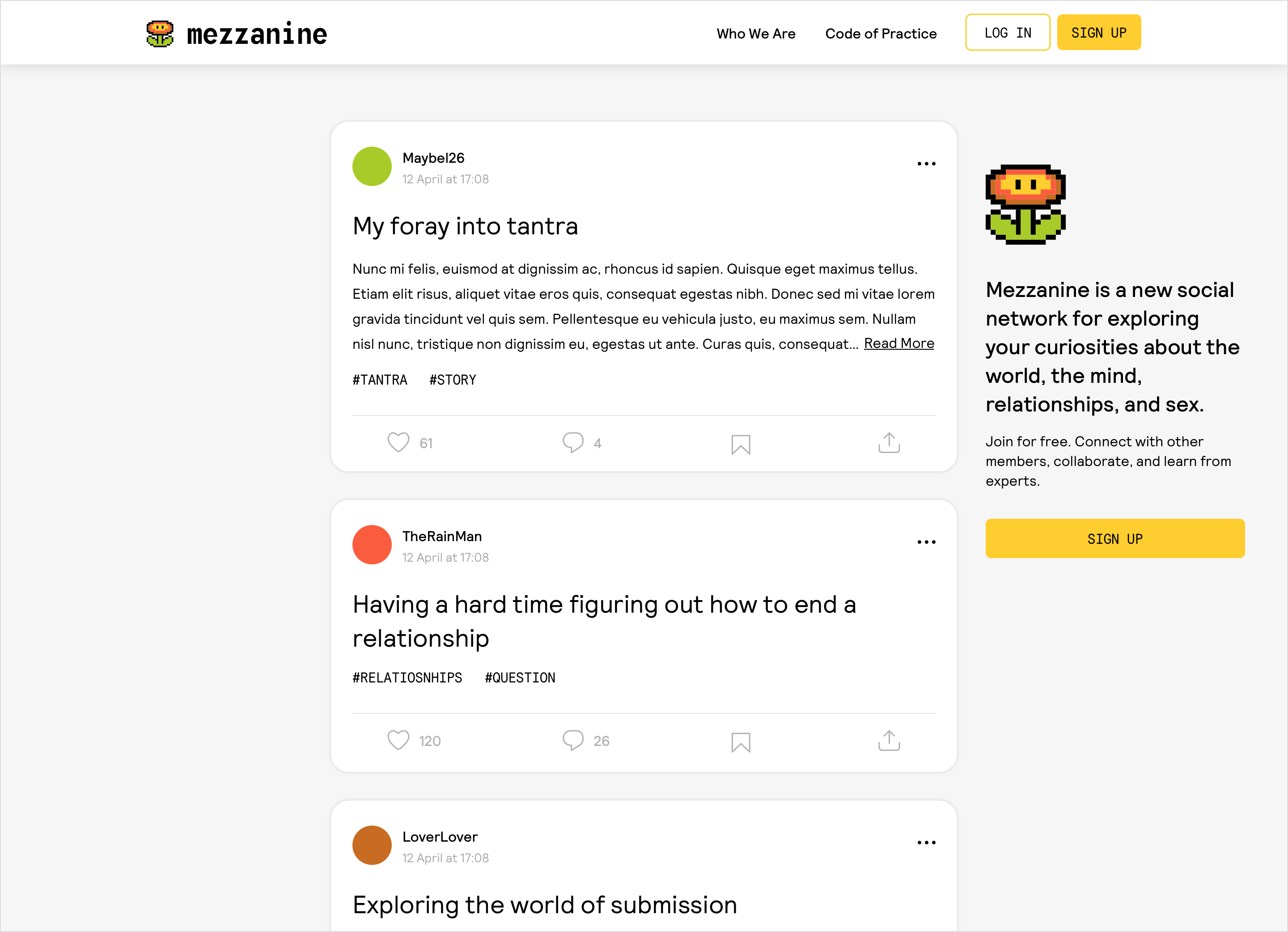
A limited public view is important for network growth. A user must sign up or sign in to 'Read More' or interact with the content.
blank
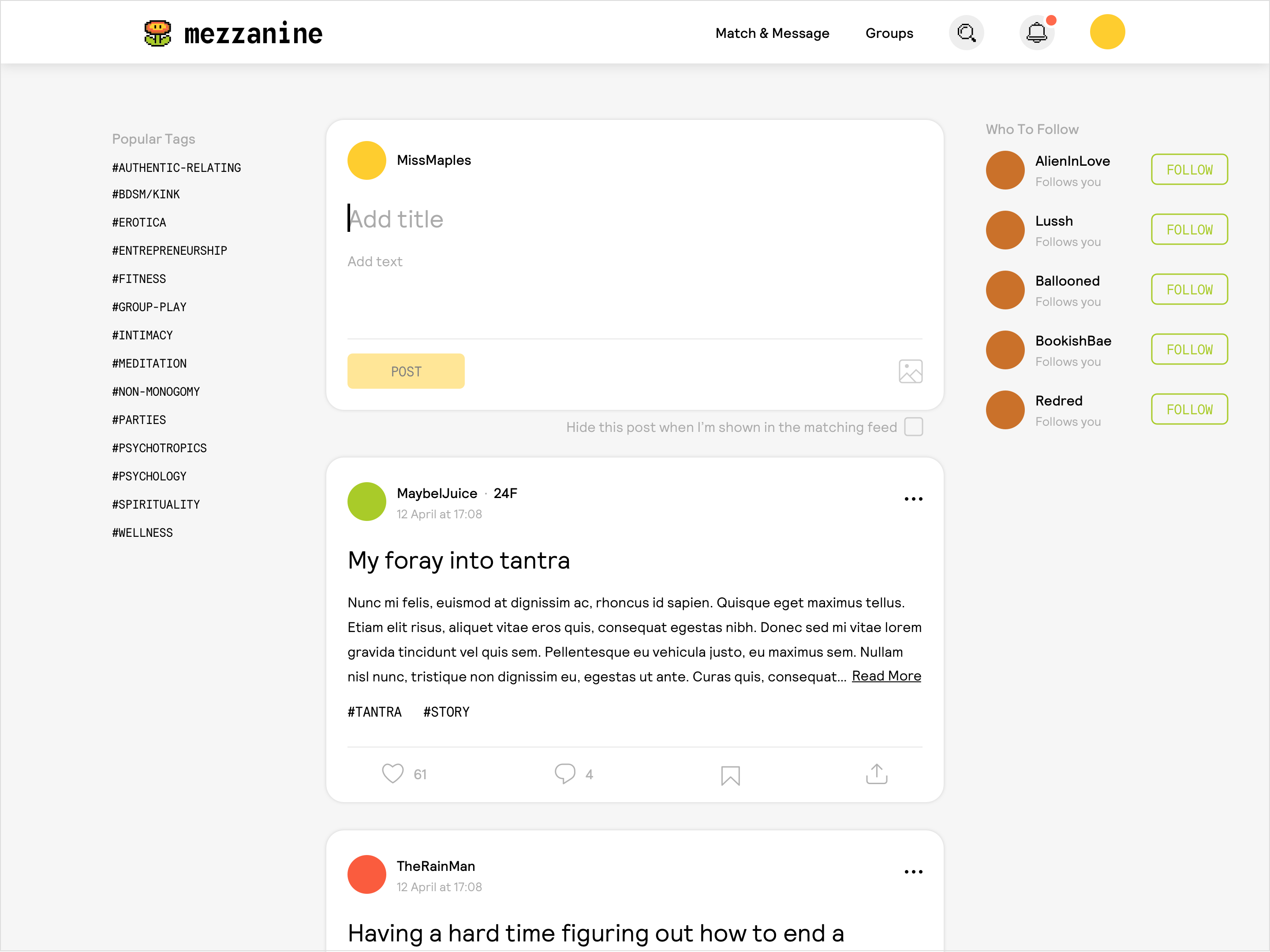
The homepage is populated with recent content from accounts you follow, popular tags, and suggested accounts.
blank
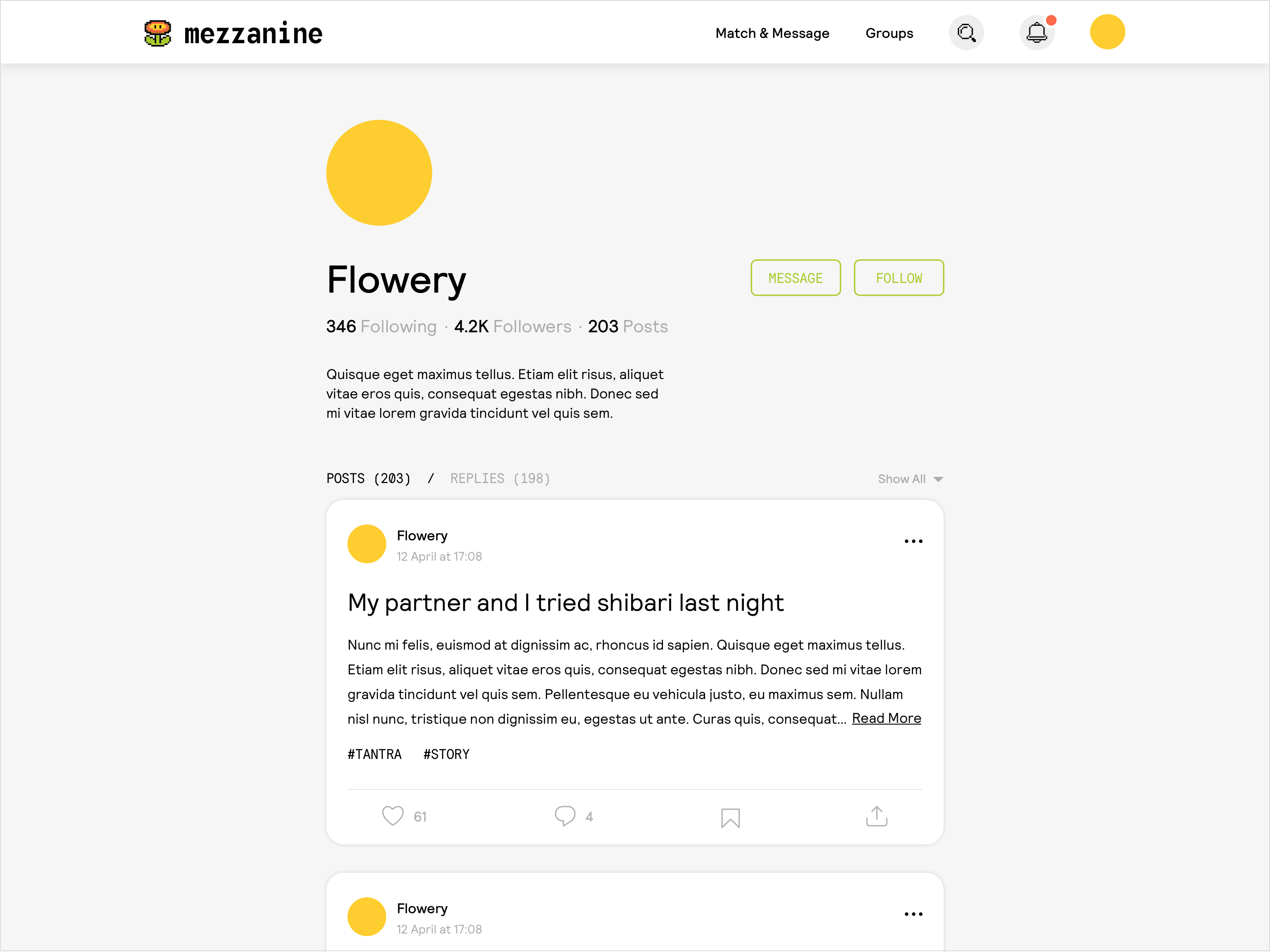
Profiles are simple. Users can follow an account, or request to send a message.
Blank
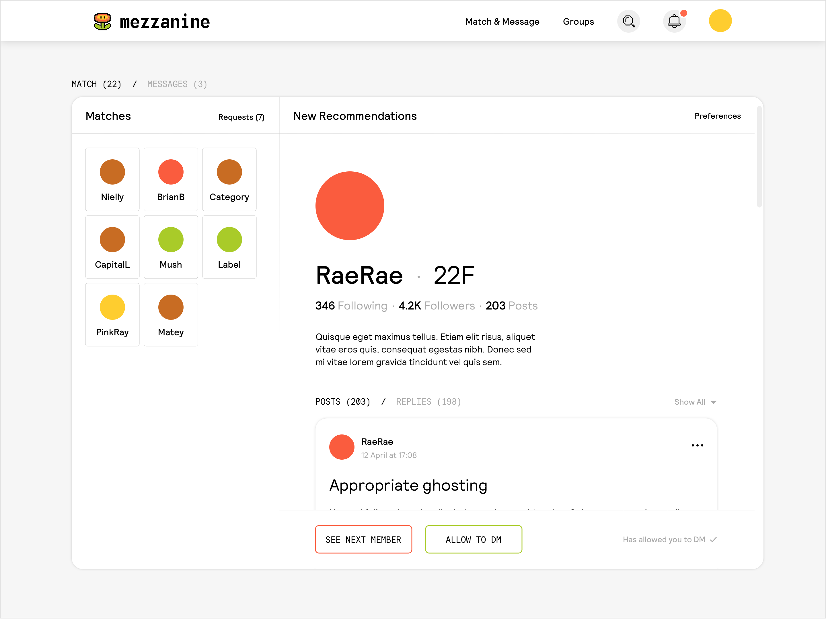
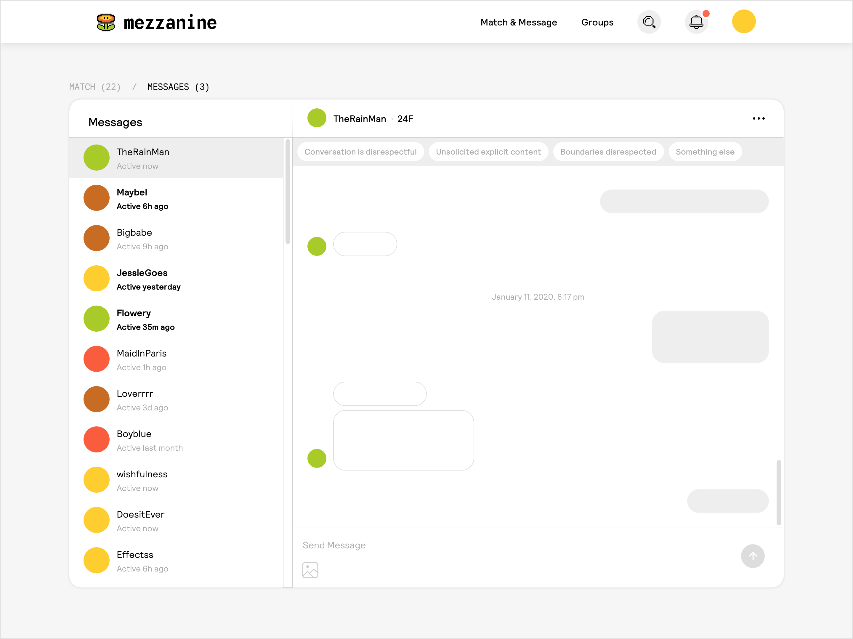
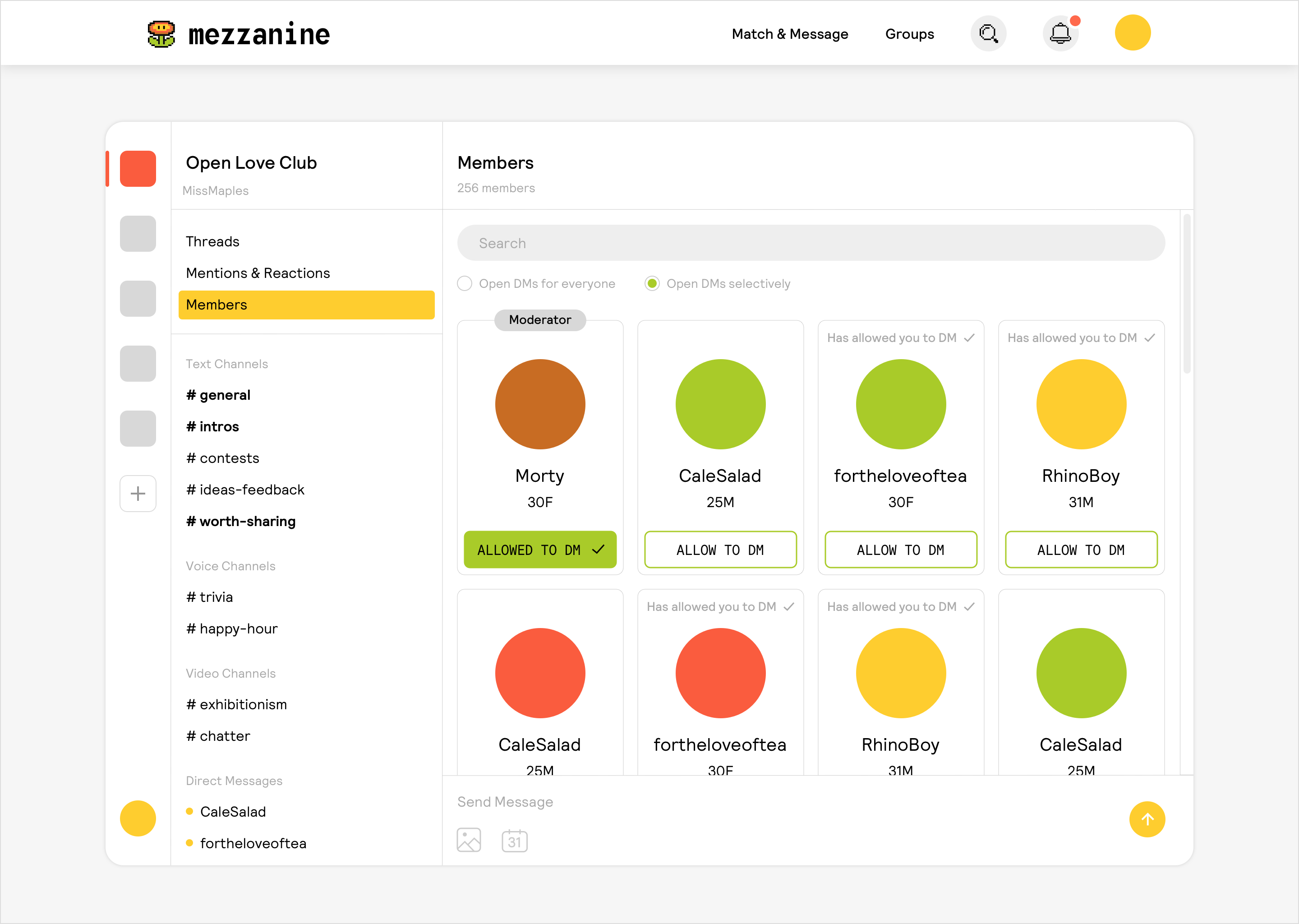
To message, two users must both 'Allow to DM' or must both follow each other. Users can browse other members in the 'New Recommendations' feed.
Blank
Reporting options are always exposed when messaging. This clearly sets the standard for conversations on Mezzanine. Data captured through the reporting system is aggregated, and repeat offenders are issued warnings.
Blank
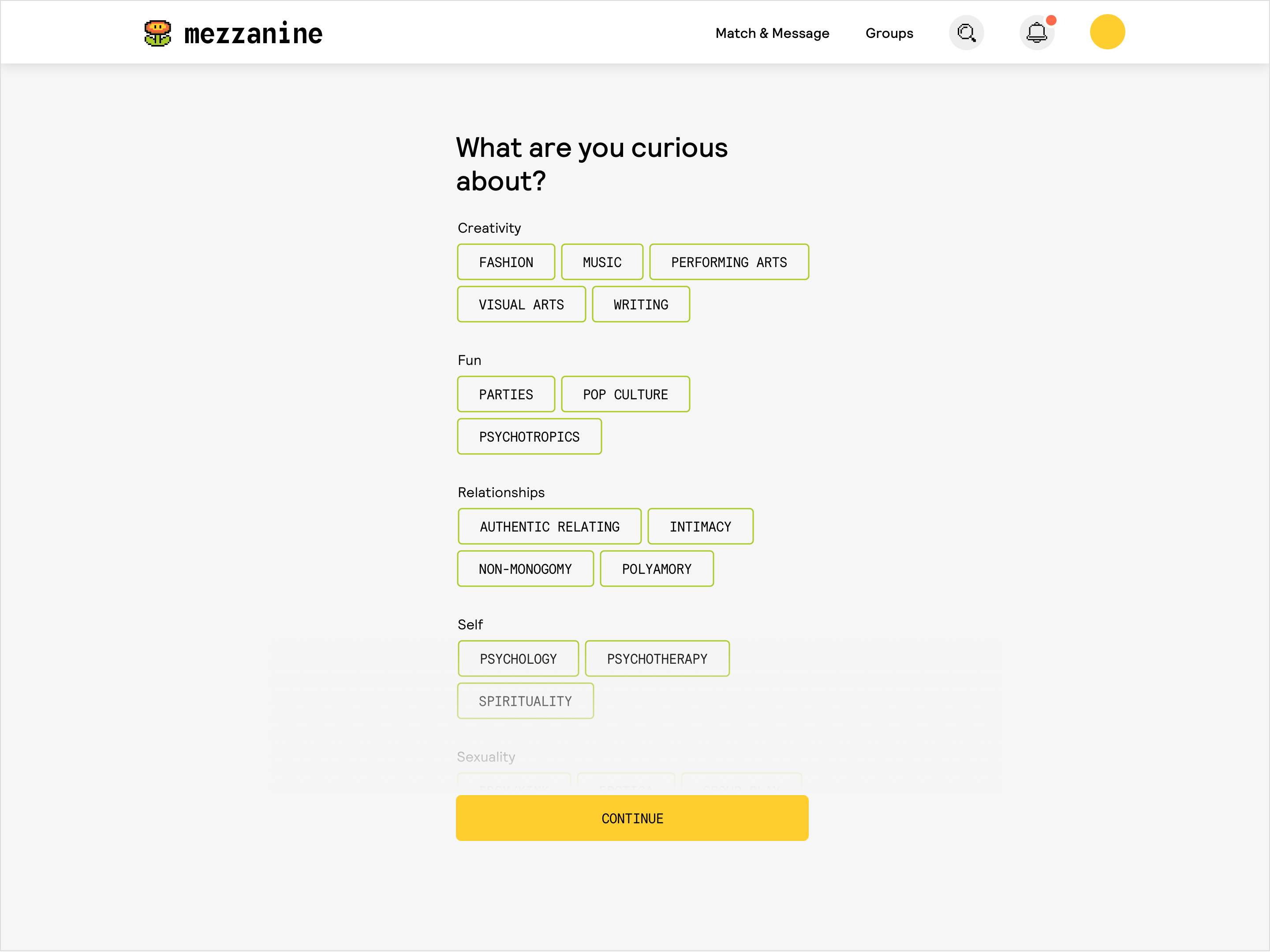
When accessing Groups for the first time, users are prompted to enter some curiousities.
Blank
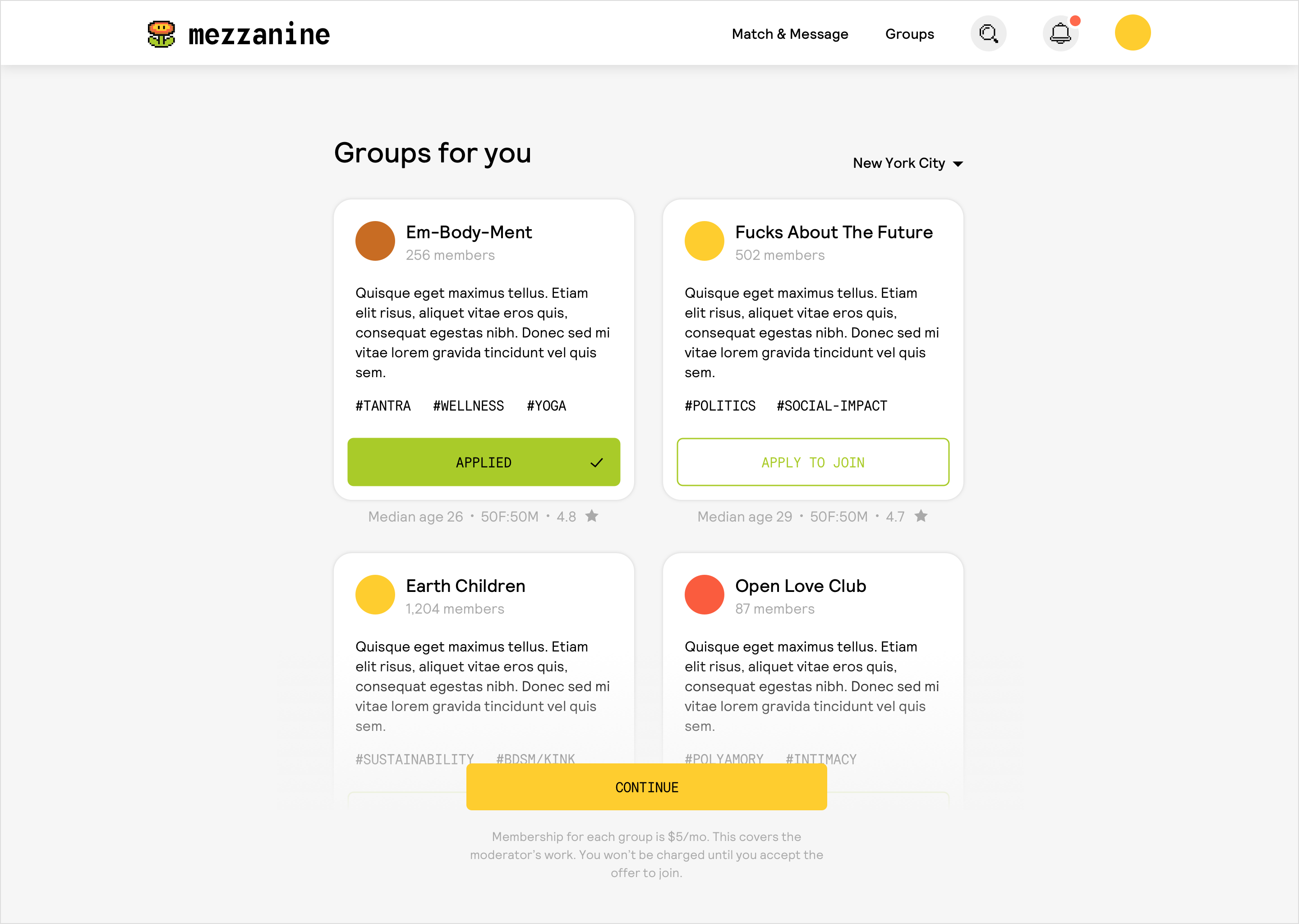
Based on their curiosities, users are suggested Groups they could apply to join.
Blank
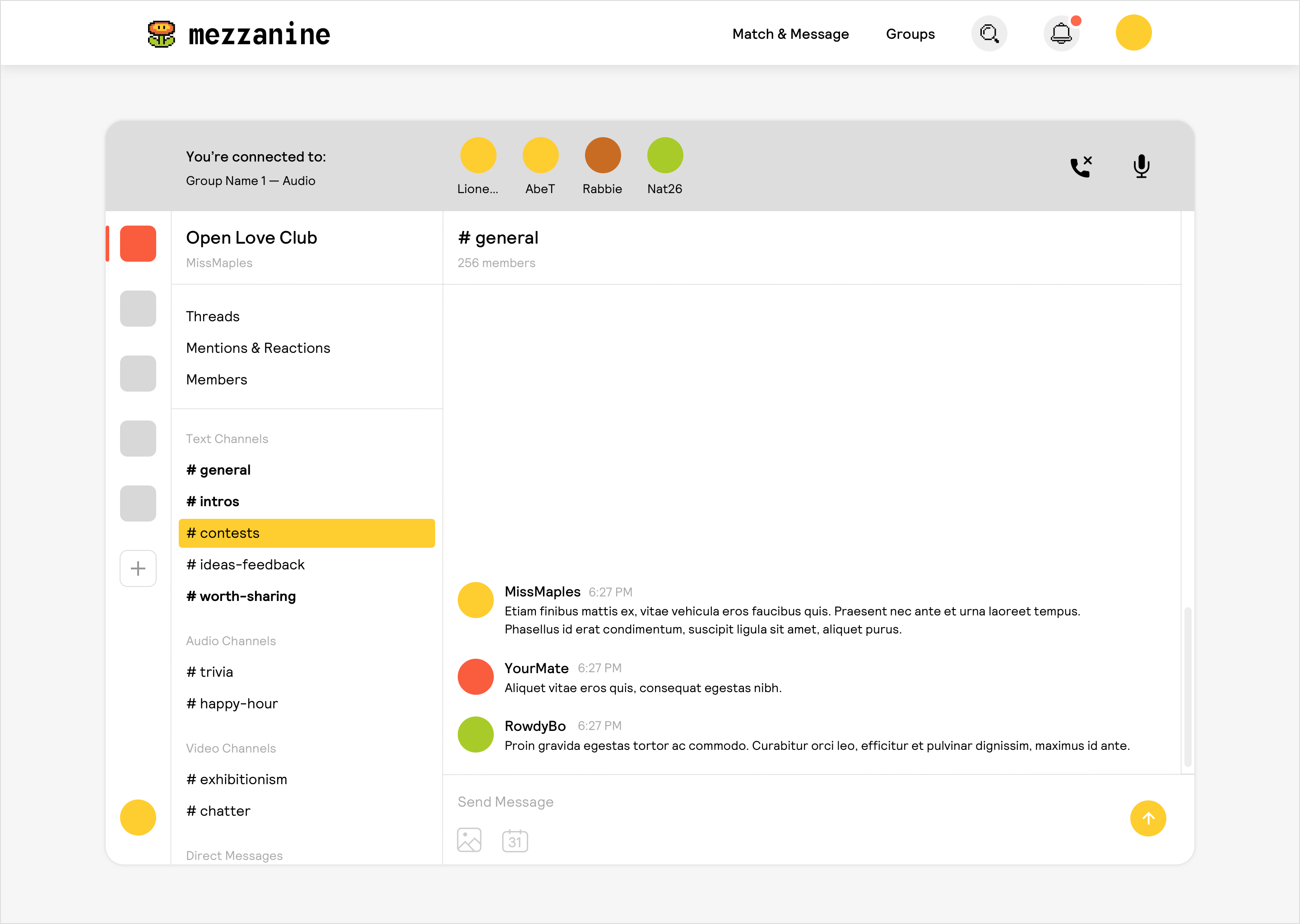
Group members can join text, audio, or video channels. Groups are designed to feel intimate and communal, using familiar community UI patterns.
Blank
'Allow to DM' facilitates clear signalling of interest. Only when two users have both 'Allowed to DM' is a 1:1 chat unlocked.
Select Work
urlTogetherProduct Design & Branding

Hinge PhotographyCreative Direction & Production
MezzanineProduct Design

HingeProduct Design & Art Direction

HomelandProduct Design
AndexProduct Design & Branding

FiClubProduct Design

MatchmakerProduct Design
Flesh CardsGame Design & Branding

Kate McLeodBranding